There’s a stretch of Hosur Road from Silk Board towards Bommanahalli where I sometimes find myself really looking. Not just passing through, but trying to understand why it feels the way it does. The paan-stained walls. The jumble of signboards in six fonts and twelve colors. Plastic bags caught in bushes, faded wrappers pressed into cracks.
It wasn’t just messy. Mess can be charming. Think of a packed bookshelf or a lively market. This was something else. Something that made me want to look away.
I’ve been designing for close to a decade now, and somewhere in that time a pattern started forming. Just something I kept noticing, across streets and screens and products and rooms. A theory about what makes things look ugly.
The Three Ingredients
Here’s what I think it comes down to. What makes something visually repulsive, not just unattractive but actively unpleasant, is the combination of three specific things: small elements, at high frequency (lots of them, packed close together, with strong color or brightness contrast), distributed randomly.
The key insight: remove any one of the three, and it stops being ugly.
Large elements, randomly placed, at high density? That’s a graffiti wall, a maximalist interior, a Hundertwasser building. Chaotic, sure. But often exciting, even beautiful. Small elements, high frequency, but ordered? temple carvings. Circuit boards. Woven fabric. Intricate and gorgeous. You could stare at them for hours. Small elements, randomly placed, but sparse? Sand. Film grain. Terrazzo. Texture. Often beautiful.
It’s only when all three combine (small, dense, and random) that the eye recoils.
The Proof: Nothing Phone (3)
When Nothing revealed the Phone (3) last year, the reaction was immediate and polarizing. A lot of people, especially fans of the earlier models, couldn’t articulate what went wrong. The word that kept coming up in forums was just busy. “It looks chaotic.” “There’s too much happening.” GSMArena called the back “a bit much.”
The framework explains it mechanically.
Same brand, same design language on paper, but the back panel crossed from organized complexity into visual noise.
The Phone (1) and Phone (2) had backs built around the Glyph Interface: LED light strips arranged in clean, symmetrical geometry. The Phone (2) won a Red Dot Design Award. It was high-frequency (lots of visual elements) but clearly ordered. Your eye could find the structure. The complexity was organized.
The Phone (3) replaced all of that with an asymmetrical layout: a periscope lens pushed to the edge, a large semicircular flash, a circular dot-matrix of 489 micro-LEDs, two more camera units, and a red recording indicator. All competing for attention with no governing geometry. Same brand, same design language on paper, but the back panel crossed from organized complexity into visual noise. Multiple reviewers used the word chaotic. One Nothing community member put it simply: “Great care seems to have been taken to ensure complete asymmetry.”
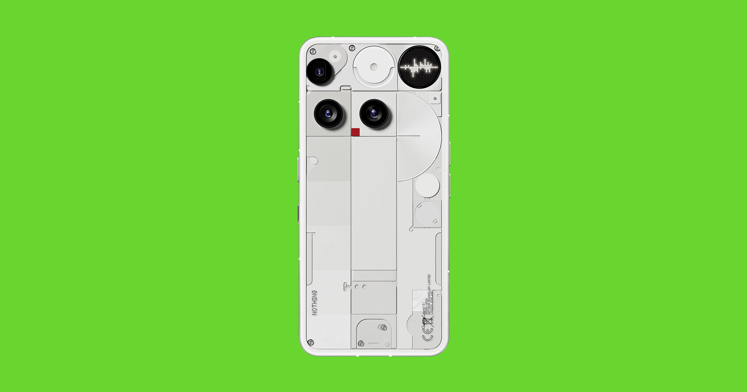 The Nothing Phone (3). Three cameras, a dot-matrix LED, a semicircular flash, a red recording dot — all competing for attention with no governing geometry. Compare this to the Phone (1)‘s clean symmetrical light strips.
The elements are small. They’re densely packed. And they’re arranged without a readable pattern. The triad.
The Proof: Wires
Look at the cables on any Indian telephone pole. If they’re run neatly, even hundreds of them, they can look graphic, almost elegant. Parallel lines have a visual rhythm. But when they’re tangled at odd angles, crossing in random directions, sagging in loops, the same cables become ugly. Same elements. Same density. Different distribution.
The randomness is what tips it over.
It Turns Out This Is Real
I held this as a personal theory for a few years before I went looking for research. What I found was vindicating. Actual scientists had been measuring this, and their findings mapped almost exactly onto what I’d been noticing.
Fernandez and Wilkins (2008) found that images people rate as uncomfortable share a specific signature: excess energy at mid-range spatial frequencies, roughly 1.5 to 6 cycles per degree of visual angle. Natural, comfortable images follow a predictable falloff: as details get finer, there’s proportionally less energy. Uncomfortable images spike in that mid-range band. This is literally the frequency signature of the visual noise I’d been reacting to on streets and screens.
The brain may be reading small + clustered + random as a danger signal. Contamination. Venom. Rot.
The trypophobia research pushed it further. Cole and Wilkins (2013) analyzed images of clustered small holes and bumps, the kind that trigger visceral disgust in a surprising number of people, and found they share the same spectral signature as highly venomous animals: the blue-ringed octopus, king cobra, deathstalker scorpion. A later study by Kupfer and Le (2018) proposed a complementary explanation: these patterns also resemble skin lesions from infectious diseases and parasites. The brain may be reading small + clustered + random as a danger signal. Contamination. Venom. Rot. There’s likely an evolutionary reason this specific combination disgusts us.
Then there’s the question of why order makes the same density feel beautiful instead of repulsive. Reber, Schwarz, and Winkielman (2004) showed that the easier a visual pattern is to process, the more beautiful it feels. Ordered patterns, even extremely complex ones, are processable because the brain can extract the underlying rule. The information theorist Jürgen Schmidhuber puts it more sharply: ordered patterns are compressible. Your brain can represent them efficiently. Random patterns of the same density are incompressible noise. There’s no shortcut, no rule to extract, and the brain recoils from the effort. This explains why temple carvings (small, dense, but ordered) are beautiful while litter on a street (small, dense, but random) is ugly. Same elements. Different organization. Completely different experience.
Richard Taylor and Branka Spehar found something similar in fractal geometry. Humans prefer fractal patterns with mid-range complexity, a fractal dimension around 1.3 to 1.5. Natural scenes like trees, clouds, and coastlines fall in this range. Random noise approaches a dimension of 2.0, which is consistently the least preferred. Taylor has reported that viewing mid-range fractals, including Jackson Pollock’s paintings which hit the sweet spot, can reduce physiological stress by as much as 60%. Structured complexity soothes. Random complexity repels.
High detail with high order produces beauty. High detail with low order produces ugliness.
The mathematician Nikos Salingaros arrived independently at a strikingly similar framework for buildings. He proposes a formula: Life = Temperature × Harmony. “Temperature” is the degree of detail, color, and curvature. “Harmony” is the degree of internal order. Crank up the detail with high harmony and you get a Gothic cathedral, intricate and alive. Crank up the detail with low harmony and you get visual noise. A building that feels dead despite being busy. Almost exactly my three ingredients applied to architecture.
What the Science Taught Me
The research sharpened my thinking in a few ways.
First, it’s not just high frequency that matters. It’s mid-range. The critical band is elements small enough to be numerous but large enough to be individually perceived, roughly 1.5 to 6 cycles per degree. Very fine grain like film noise or fabric weave falls below the threshold; the eye doesn’t resolve it sharply enough for it to register as unpleasant. That’s why sand and film grain feel fine even though they’re small and random. They’re below the discomfort band.
Second, “small elements” and “high frequency” are really entangled. Many small things inherently create mid-range frequency content. The cleaner formulation is probably two axes: how much visual energy sits in that critical mid-range band, and how ordered or random the arrangement is. But the three-factor version is more intuitive and more useful as a practical tool for designers. I’ve kept it.
And what it looks like matters too. A random scatter of wildflowers might bother you less than a random scatter of ambiguous blobs, even if the spatial frequency content is identical. The brain is also pattern-matching at a semantic level: does this look like disease? rot? infestation? This is a layer on top of the spatial statistics, not a replacement for them.
Seeing Differently
Understanding why something looks wrong is a different skill from knowing that it looks wrong. Every designer develops the second instinct early. The first one took me years.
Now when I’m working on something and it feels off but I can’t figure out why, I check for the triad: small, mid-frequency, random. More often than not, that’s where the problem is. Reduce the density. Introduce a grid. Increase the scale. The ugliness has a structure, and the structure has a fix.
There's something weirdly comforting about being able to name the thing that's been bothering you.
And when I’m on that Hosur Road stretch now, I don’t just see mess. I see a specific kind of visual information that the human brain has been trained over millions of years to recoil from. The signature of contamination, of danger, of biological threat encoded in spatial frequencies. There’s something weirdly comforting about being able to name the thing that’s been bothering you. The street hasn’t changed. But I’m not just flinching anymore. I’m reading it.
References
- Fernandez, D., & Wilkins, A.J. (2008). “Uncomfortable images in art and nature.” Perception, 37(7), 1098-1113. DOI: 10.1068/p5814
- Cole, G.G., & Wilkins, A.J. (2013). “Fear of Holes.” Psychological Science, 24(10), 1980-1985. DOI: 10.1177/0956797613484937
- Kupfer, T.R., & Le, A.T.D. (2018). “Disgusting clusters: trypophobia as an overgeneralised disease avoidance response.” Cognition and Emotion, 32(4), 729-741. DOI: 10.1080/02699931.2017.1345721
- Sasaki, K., et al. (2017). “Trypophobic Discomfort is Spatial-Frequency Dependent.” Advances in Cognitive Psychology, 13(3), 224-231. DOI: 10.5709/acp-0222-2
- Reber, R., Schwarz, N., & Winkielman, P. (2004). “Processing Fluency and Aesthetic Pleasure: Is Beauty in the Perceiver’s Processing Experience?” Personality and Social Psychology Review, 8(4), 364-382. DOI: 10.1207/s15327957pspr0804_3
- Schmidhuber, J. (2009). “Driven by Compression Progress.” arXiv: 0812.4360
- Taylor, R.P. (2006). “Reduction of Physiological Stress Using Fractal Art and Architecture.” Leonardo, 39(3), 245-251. DOI: 10.1162/leon.2006.39.3.245
- Spehar, B., et al. (2003). “Universal aesthetic of fractals.” Computers & Graphics, 27(5), 813-820. DOI: 10.1016/S0097-8493(03)00154-7
- Salingaros, N.A. (1997). “Life and Complexity in Architecture From a Thermodynamic Analogy.” Physics Essays, 10, 165-173. Online
- Cavalcante, A., et al. (2014). “Measuring Streetscape Complexity Based on the Statistics of Local Contrast and Spatial Frequency.” PLOS ONE, 9(2), e87097. DOI: 10.1371/journal.pone.0087097