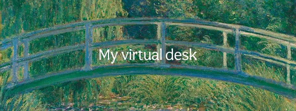
Web banner featuring bridge from Monet's Water Lilies with the text 'My Internet Corner' written on it

🌿 Digital Garden

A living collection of thoughts, ideas, and reflections that grow and evolve over time. Each entry connects to others, creating a web of interconnected knowledge.

6 entries growing 1 mature thoughts 13 connections

The Art of Slow Living

In a world obsessed with speed, there’s profound beauty in choosing slowness. When we slow down, we notice the texture of paper, the weight of a pen, the way light changes throughout the day.

The art of slow living isn’t about being lazy or unproductive—it’s about being intentional with our time and attention. It’s about creating space for depth in a world that rewards surface-level engagement.
Connected to:

Design as Empathy

Every design decision is an act of empathy. We’re not just arranging pixels or choosing colors—we’re crafting experiences that honor the human on the other side of the screen.

When we design with empathy, we consider not just what looks good, but what feels good. What makes someone feel welcomed? What helps them accomplish their goals without friction? What respects their time and attention?

The best designs are invisible—they serve the human need so well that the interface disappears, leaving only the meaningful interaction.

Connected to:

The Texture of Digital Spaces

Digital spaces can have texture too. The gentle rotation of a paper form, the subtle grain of a background, the way shadows fall—these details create atmosphere and emotion.

We often think of digital design as flat and sterile, but the most memorable digital experiences have a tactile quality. They feel like places you want to spend time in, not just functional tools to use quickly.

The texture comes from the imperfections: the slight asymmetry, the hand-drawn elements, the natural variations that make something feel human-made rather than machine-generated.

Connected to:

Minimalism vs. Emptiness

Minimalism isn’t about emptiness—it’s about intentionality. Every element that remains has earned its place through purpose and meaning.

Empty spaces in design aren’t voids to be filled, but breathing room that allows the important elements to speak more clearly. The space between notes is what gives music its rhythm.

True minimalism requires the courage to say no to good things in service of great things. It’s not about having less for the sake of less, but about making room for what matters most.

Connected to:

The Weight of Words

Typography carries emotional weight. A handwritten font whispers intimacy, while a sans-serif speaks with clarity. The choice of typeface is the choice of voice.

Every font has a personality, a mood, a cultural context. Comic Sans feels casual and approachable. Times New Roman feels formal and authoritative. The words might be the same, but the typography shapes how they’re received.

Good typography is invisible until it’s not. When it’s wrong, it creates friction. When it’s right, it becomes a transparent vessel for meaning.

Connected to:

Imperfection as Beauty

The slight rotation of a form, the gentle asymmetry of handwriting, the natural variation in color—these imperfections breathe life into digital spaces.

Perfection is sterile. It’s the small deviations from the grid, the subtle inconsistencies, the human touches that make something feel alive and approachable.

In Japanese aesthetics, this is called wabi-sabi—finding beauty in imperfection and impermanence. It’s the recognition that flaws don’t diminish beauty; they define it.

Connected to: